Graphic design is so easy, bro
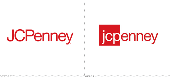 Look: JC Penney rebranded. They discovered this “bold new logo” in a contest.
The logo was designed to evoke a sense of movement and discovery as the letters appear to break out of the box, symbolizing an emergence into an exciting, new future.
Oh, and guess what? They aren’t JCPenney anymore. They’re jcpenney. With no capital letters. Young people leave the capital letters off things, so if JCPenney leaves capital letters off its name, they will instantly appear youthful and relevant.
And people think graphic design is difficult. Honestly I don’t even know why I’m going to school. Clearly, if I use lowercase Helvetica for every project I will succeed in life.